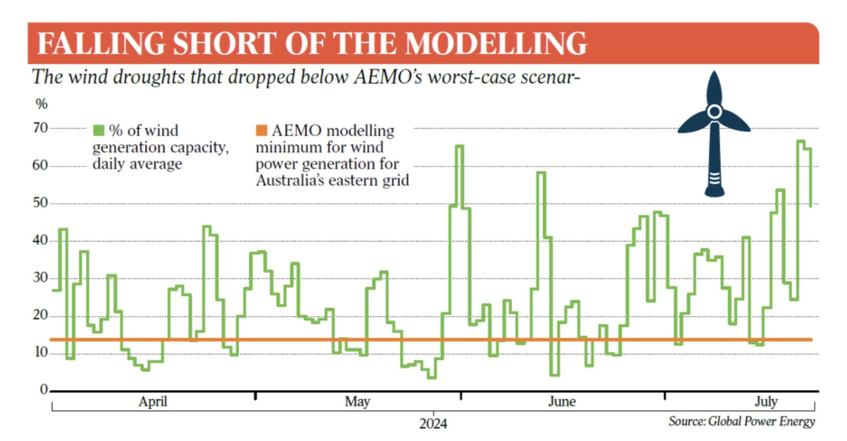
HomeScience NewsWhat’s wrong with this chart? A short case study in graphical misinformation Science News What’s wrong with this chart? A short case study in graphical misinformation December 9, 2025 0 6 - Advertisement - In recent weeks this chart has circulated through the usual redoubts of climate and energy contrarianism – The Australian, Sky News, the Institute of Public Affairs etc – and several times here on LinkedIn, in a slightly different format. It first seems to have appeared in a… Click here to view the original article. TagsReneweconomy.com.au - Advertisment - Share FacebookTwitterReddItPinterestEmail Previous articleFrom flare to flow as Beetaloo wins final NT gas approvalNext articleIndustry calls for urgent changes to Cheaper Home Batteries rebate, to avoid harmful “boom-bust cycle” RELATED ARTICLES Science News Immune cells flood into the aging brain, Stanford scientists discover Australian Online News - August 14, 2026 Science News Scientists detect a nuclear reactor’s ghostly afterglow for the first time Australian Online News - August 14, 2026 Science News S-curve modelling says renewables can kick coal out of Australia by 2032. But is this soon enough? Australian Online News - August 14, 2026 - Advertisement - Recently Viewed ACT trails nation in bulk-billing growth rate August 10, 2026 ANZ share price rises 5% on 3Q FY26 update August 13, 2026 City investors had doubts but Agscent breath test is big for ag | Farm Online August 10, 2026 Many states cover doula care, but access is often out of reach August 12, 2026 Load more